Histogram vs Bar Chart: Worked Examples and Practice Questions
A bar chart compares categories. A histogram groups numerical measurements into intervals. Learn the difference, read two examples, and test your understanding.
When should you use each chart?
Use a bar chart for distinct categories: favourite subjects, types of pets, or ways of travelling to school. Each bar represents one category; its length or height shows a value, such as a count. Bars have gaps. Horizontal and vertical versions both work.
Use a histogram for a distribution of numerical measurements: journey times, heights, or masses. Split the number line into intervals called bins and count the measurements in each bin. Adjacent bins touch and must stay in numerical order.
| Feature | Bar chart | Histogram |
|---|---|---|
| Groups | Distinct categories | Numerical intervals |
| Spacing | Gaps between bars | Adjacent intervals touch |
| Order | Often flexible; keep a meaningful order | Fixed numerical order |
| What to compare | Bar lengths or heights | Areas; heights also work for equal-width bins |
Choose by the question and the data, not just the appearance. A category code such as bus = 1 is still a category; coding it with a number does not make it a measurement.
Bar chart: how pupils travel to school
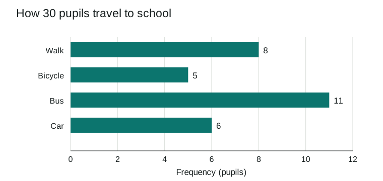
A fictional class of 30 pupils reports its main travel mode. Walk, bicycle, bus, and car are categories, so use a bar chart.
| Travel mode | Frequency (pupils) |
|---|---|
| Walk | 8 |
| Bicycle | 5 |
| Bus | 11 |
| Car | 6 |
| Total | 30 |
Read it: the bus bar is longest, with 11 pupils. Walking and cycling together account for 8 + 5 = 13 pupils. Reordering the categories would leave those counts unchanged.
Make your own bar chart or download the sample categories (CSV).
Histogram: how long the journey takes
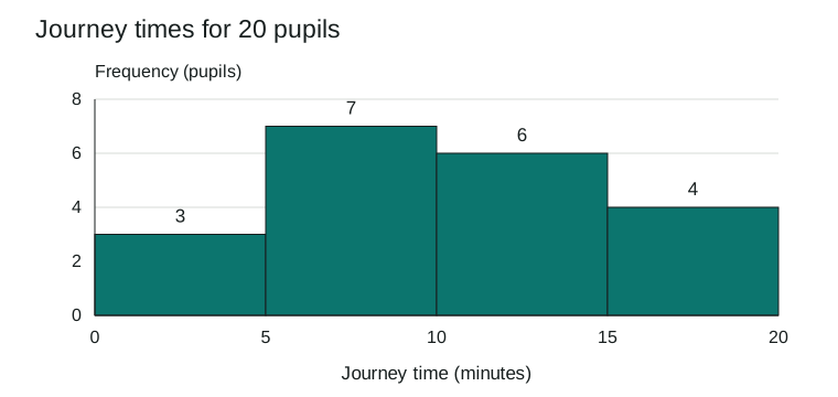
A separate fictional sample records journey times for 20 pupils, measured in minutes. Times are numerical measurements, so group them into 5-minute bins. These pupils are a different sample from example 1.
Raw data (minutes):
2, 2.8, 4.1, 5, 5.6, 6.2, 7, 8.1, 8.5, 9.7, 10, 10.9, 11.4, 12.2, 13.6, 14.8, 15, 16.3, 18.1, 19.4
| Journey time, t (minutes) | Frequency (pupils) |
|---|---|
| 0 ≤ t < 5 | 3 |
| 5 ≤ t < 10 | 7 |
| 10 ≤ t < 15 | 6 |
| 15 ≤ t ≤ 20 | 4 |
| Total | 20 |
Count it: 2, 2.8, and 4.1 belong to 0 ≤ t < 5, giving frequency 3. Exactly 5 minutes goes into the next bin; exactly 10 goes into 10 ≤ t < 15. Each value is counted once. The last bin includes 20, its upper boundary.
Read it: 5 ≤ t < 10 is the modal interval, with 7 pupils. Ten pupils took at least 10 minutes: 6 + 4 = 10. A histogram shows grouped counts; it does not tell you every exact value within a bin.
Recreate this histogram in ChartMaker
Open the lesson data in Histogram Maker. The 20 values, title, axis labels, and custom bin width of 5 are already filled in. Check that the frequencies are 3, 7, 6, and 4, then try a width of 10 to see how grouping changes the picture.
No account is needed. You can edit the data and download a PNG of your chart.
What if histogram bins have different widths?
In a histogram, bar area represents frequency. For equal-width bins, comparing heights gives the same comparison as comparing areas. For unequal widths, use frequency density = frequency ÷ bin width for the height.
For example, merging the first two bins gives 10 pupils across 10 minutes, so its density is 1 pupil per minute. The 10-to-15-minute bin has 6 pupils across 5 minutes, so its density is 1.2. The wider bin holds more pupils overall, but fewer per minute of interval width.
ChartMaker's Histogram Maker uses equal-width bins and frequency heights. Use the extension question below to practise the density calculation for unequal widths.
Five practice questions
Use the two examples above. Try all five before opening the answers.
- Choose a chart for (a) pupils' favourite school subjects and (b) their measured journey times. Explain each choice.
- In the travel-mode bar chart, which category has the highest frequency? How many more pupils use that mode than a bicycle?
- In the journey-time histogram, which interval has the highest frequency, and how many pupils are in it?
- Which bin contains a journey time of exactly 10 minutes? What percentage of the 20 pupils took at least 10 minutes?
- Extension: merge the first two histogram bins into 0 <= t < 10. Find its frequency and frequency density. Why would frequency heights be misleading when the remaining bins are 5 minutes wide?
Show answers and working
- (a) A bar chart, because subjects are distinct categories. (b) A histogram, because measured times are numerical measurements that can be grouped into ordered intervals.
- Bus has the highest frequency: 11 pupils. The difference is 11 - 5 = 6 pupils.
- The modal interval is 5 <= t < 10 minutes, with 7 pupils. This identifies a group of times, not a single most common exact time.
- Exactly 10 minutes belongs to 10 <= t < 15. There are 6 + 4 = 10 pupils with times of at least 10 minutes, so (10 / 20) x 100 = 50%.
- The merged bin has frequency 3 + 7 = 10 and width 10 minutes. Its frequency density is 10 / 10 = 1 pupil per minute. The remaining densities are 6 / 5 = 1.2 and 4 / 5 = 0.8. With unequal widths, use density for height so each bar's area represents frequency; raw frequency heights would overstate the wider bin's area.
Download the classroom worksheet
The free A4 PDF contains both charts and datasets, five questions with writing space, and a separate teacher answer page. Print pages 1-2 for pupils and keep page 3 for marking. Suggested time: 20-30 minutes; question 5 is an extension.
Download worksheet and answers (PDF)You may print and share the worksheet for classroom and home learning. The sample data is fictional and contains no pupil information.
Remember the distinction
For categories, use a bar chart. For measurements grouped into ordered intervals, use a histogram. Label the axes, state the units, and always check the bin boundaries before counting.